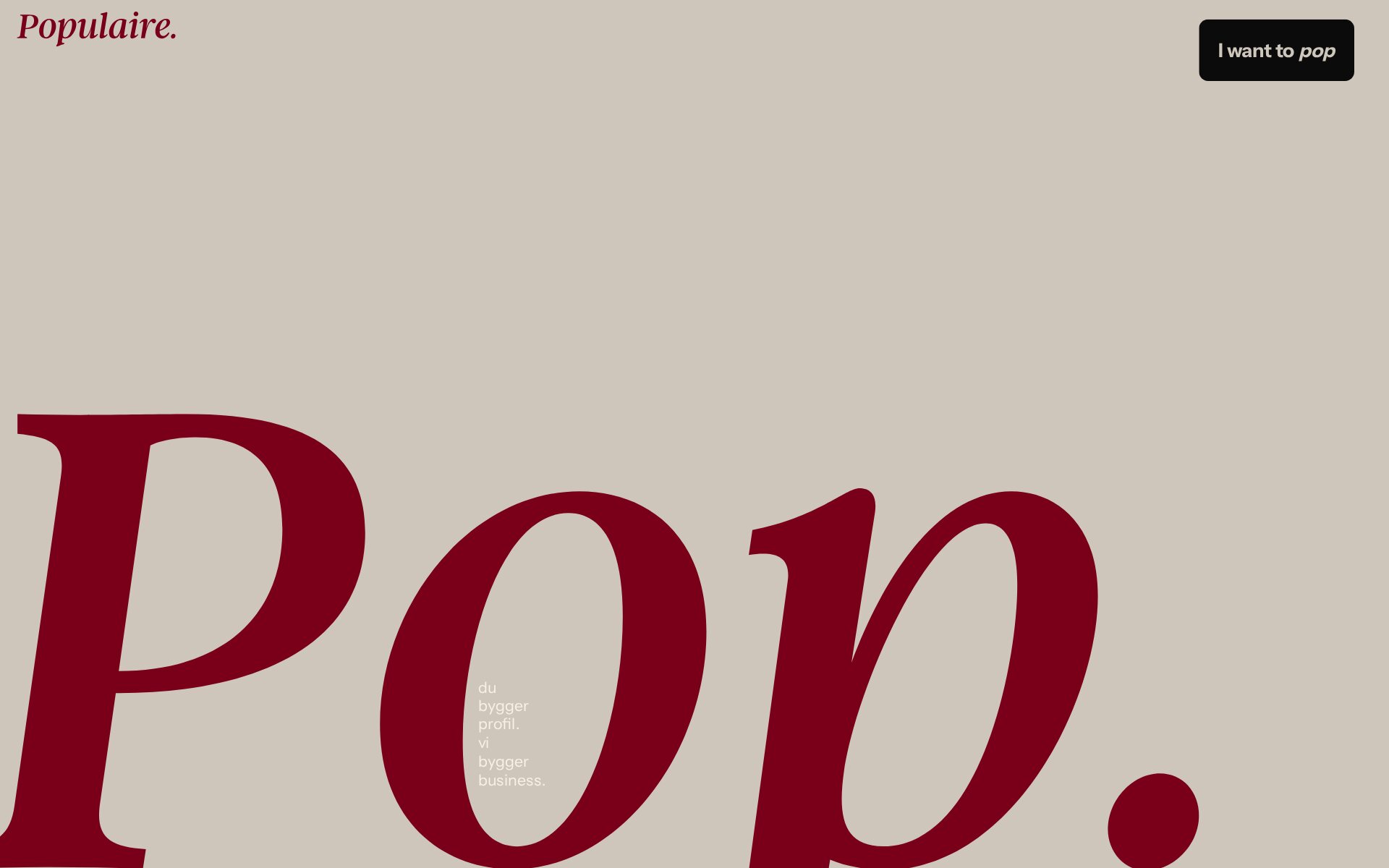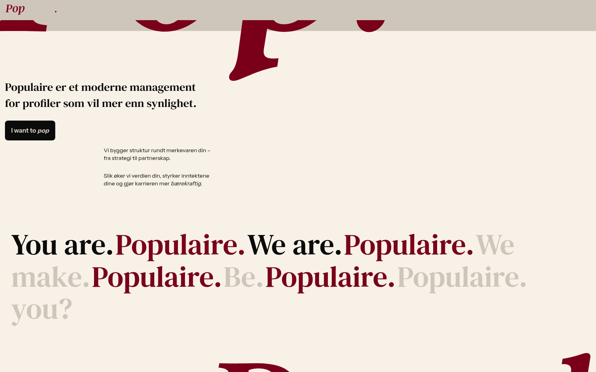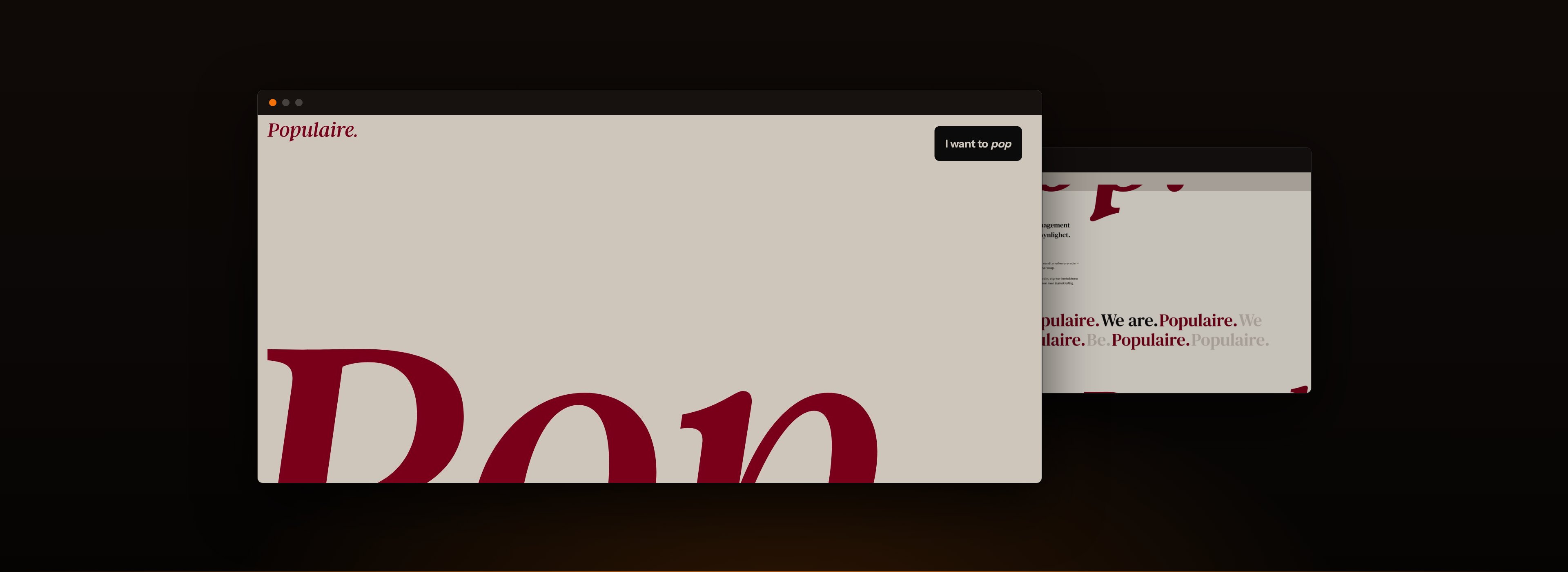
Populaire is a Norwegian management company for creators and public profiles. The design it commissioned is loud on purpose. INFIGO’s job was to ship it as drawn.
01 · The context
The brief was fidelity.
A management company for people whose work is being noticed cannot have a careful website. This one was designed accordingly: type at a scale most sites would flinch at, an editorial rather than templated layout, motion running through it.
Designs like that arrive at the build stage as a negotiation. Something in the composition does not survive a narrow viewport, a transition is awkward to implement, and the honest-sounding compromise is to simplify it slightly. Do that four or five times and what launches is recognisably a reduction of what was approved, which everyone notices and nobody quite mentions.
02 · The build
Implement it, do not approximate it.
The design is the client’s and the engineering is ours, which makes the standard simple: the thing that goes live should be the thing that was drawn. The oversized type holds its composition across sizes rather than being scaled down to something safe, and the motion is implemented as specified rather than replaced with a fade.
Underneath, it is a custom WordPress theme with the content in ACF, so a site that looks handmade is still one the company can edit.
03 · The long haul
Built to be edited without being flattened.
The risk with a design this specific is that the first content update starts eroding it. Composing the pages from defined modules rather than a freeform builder means the client can change what a page says without changing what the brand looks like.
What we delivered
- A custom WordPress build of an animation-heavy, typography-led design.
- Composition and motion implemented to the design rather than approximated.
- ACF-driven content so the site stays editable without drifting off-brand.