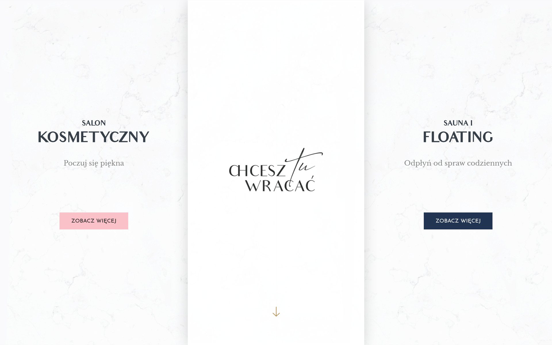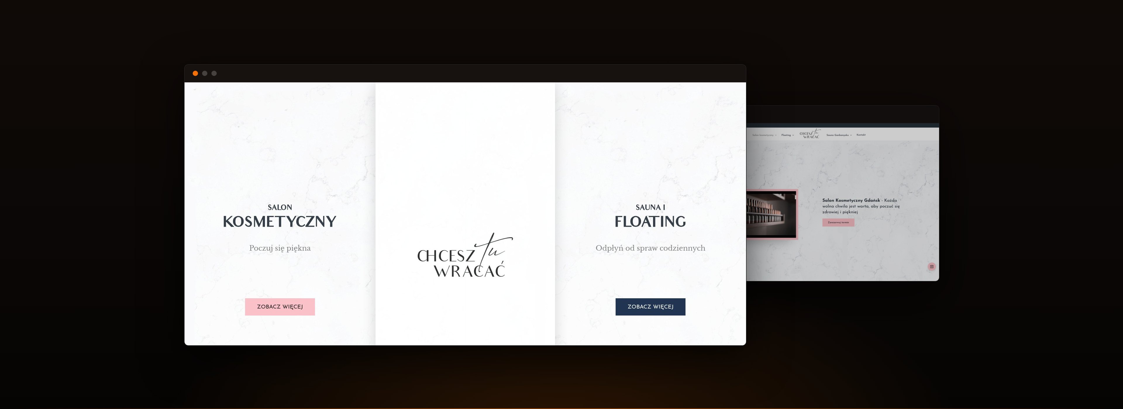
Chcesz tu Wracać is two businesses at one Gdańsk address under one name: a beauty salon on one side, floating and a Ganbanyoku sauna on the other. INFIGO designed and built their site.
01 · The context
Two audiences who want nothing to do with each other.
Somebody booking a manicure and somebody booking an hour in a flotation tank are not the same customer, and a website that averages them out serves neither. The usual answer is a single navigation with both offers crammed in, which forces every visitor to read past the half that does not apply to them.
The other usual answer is two separate websites, which means two installs, two sets of updates, two hosting bills and two places to change a phone number.
One more thing worth naming.
This is one of the few INFIGO cases where the design came from the same desk as the build. Normally the client brings a designer and INFIGO turns their files into a working site; here the visual direction was ours too.
02 · The build
Fork at the door, share everything behind it.
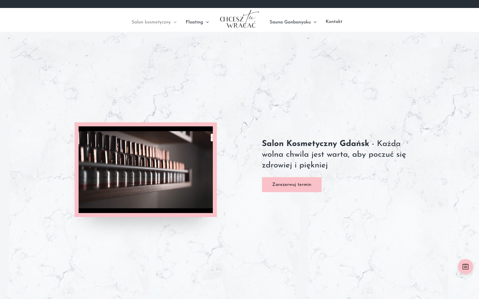
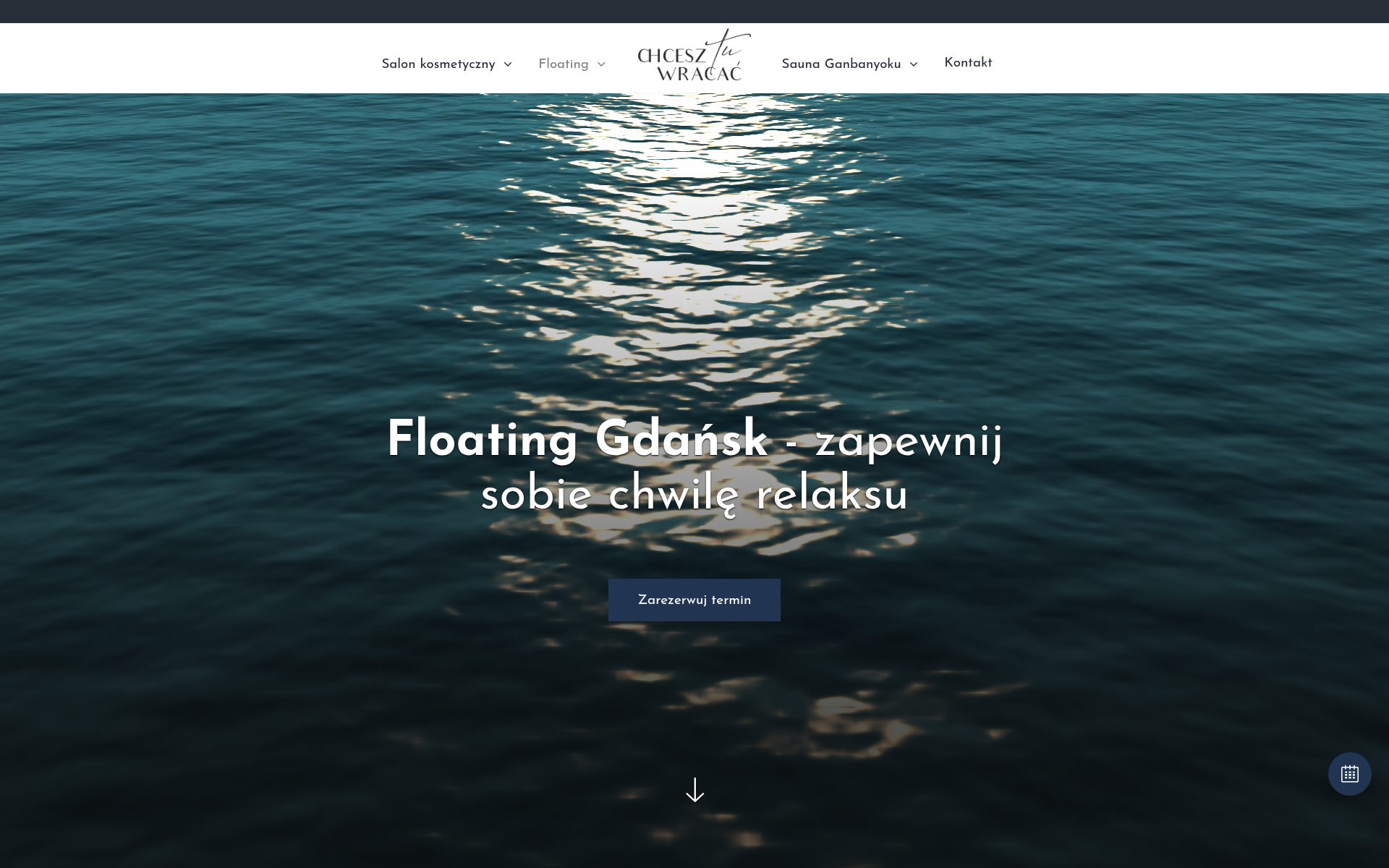
The front page is a choice between the two halves and nothing else. Past that, each side has its own colour, its own service pages and its own blog, while the header, the contact details and the WordPress install underneath are shared. One thing to maintain, two things to visit.
The service pages on the floating side are deliberately long. Somebody who has never floated before wants to know what actually happens, how warm the water is, how often it is changed, and whether it is a bad idea for them. Those answers belong on the page, not in a phone call.
Booking is handed to Booksy rather than rebuilt. A salon already runs its calendar there, its staff already know it, and a bespoke booking system would have been a second thing to maintain for no gain. The site’s job is to get the right person to the right booking link.
03 · The long haul
Live, on this build, four years on.
chcesztuwracac.pl still runs the site described here, with content added over the years since launch. It is a small local build rather than a platform, and it is in the portfolio for what it gets right: a structural decision at the front door that saved the owner from running two websites.
What we delivered
- Visual design and build for a two-sided business on one WordPress install.
- A front page that forks to the right half instead of merging both.
- Separate palettes, service pages and blogs per side, with shared navigation and contact.
- Long-form service pages written to answer a first-timer’s questions before booking.
- Booking routed to the studio’s existing Booksy calendar rather than rebuilt.